

1. Start with the question a shopper still has
A product page earns a purchase by helping someone decide. Before changing its look, ask what a first-time visitor needs to know: What is included? Which size or version fits? When will it arrive? What happens if it does not work out? Shopify’s guidance emphasizes clear product identity, price, options, availability, a concise description, and an obvious way to add the item to cart [1].
For example, a ceramic mug seller may have attractive photography but omit capacity and whether the glaze varies. A short specification and a close-up showing natural variation can answer both questions more effectively than another decorative banner. List the top customer questions from support messages, reviews, and returns, then check whether the page answers them before the purchase action.
- Record the three most common pre-purchase questions for the product.
- Make price, variant choices, stock status, delivery expectations, and returns easy to locate.
- Remove claims that cannot be supported by the product facts or store policy.
2. Make the product image sequence do useful work
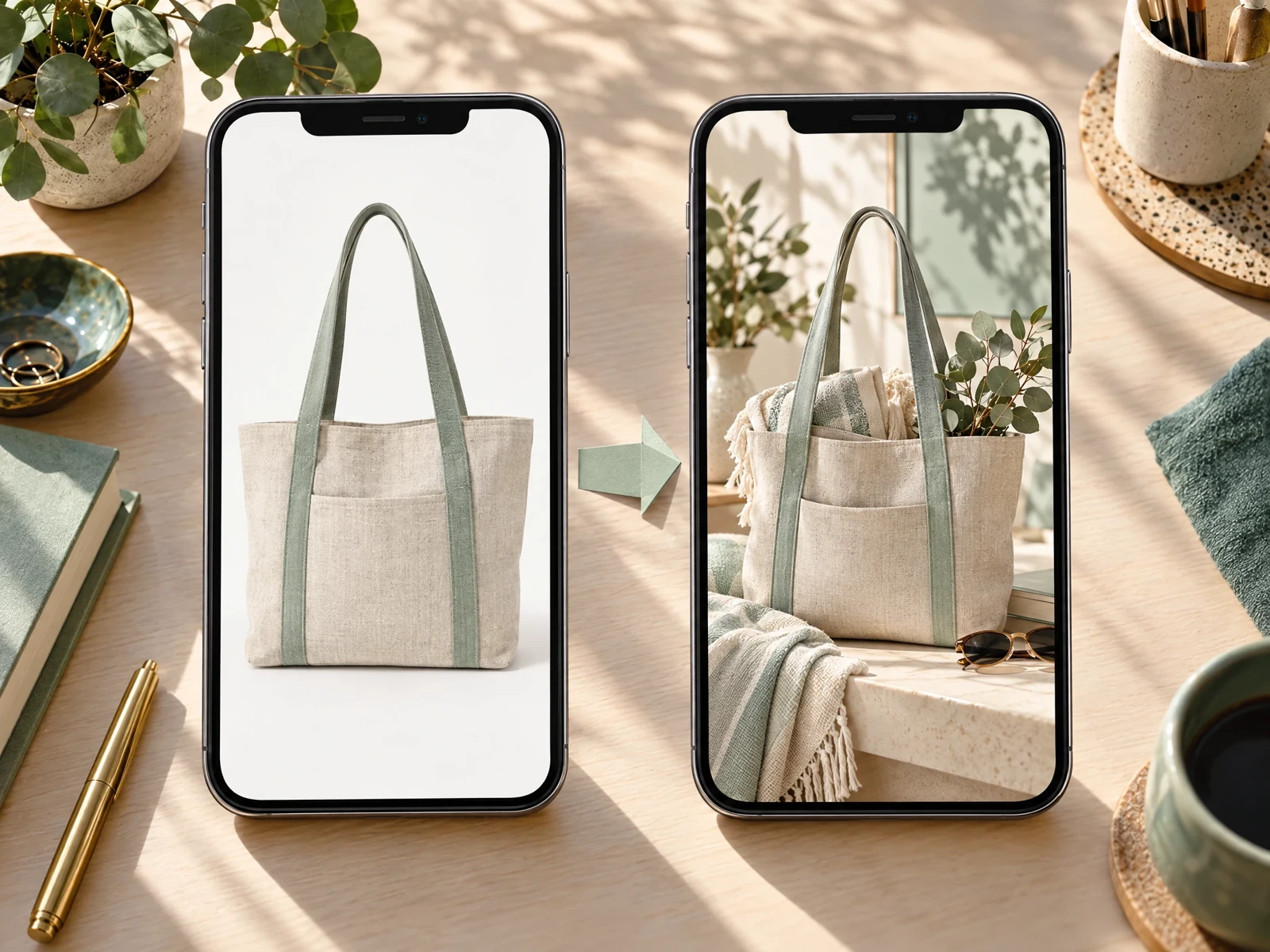
Images should answer different questions, not repeat the same pose. Lead with a clear view of the item, then show useful angles, close-up details, scale, and the product in a realistic setting where context helps. Shopify recommends identifiable images and zoomable detail, with lifestyle imagery useful for showing use and setting [1] [2].
A backpack page, for instance, could show the front, interior pockets, zipper detail, and the bag worn beside a person for scale. Keep the actual product faithful: colors, components, and proportions should not be invented in a visual treatment. On mobile, check that the gallery is easy to swipe and that important details are not cropped.
- Assign each image a role: identify, explain a detail, show scale, or demonstrate use.
- Use consistent framing across related products so shoppers can compare them.
- Review image order and crops on a real phone-sized preview, not only a desktop canvas.
3. Put the buying controls where shoppers can find them
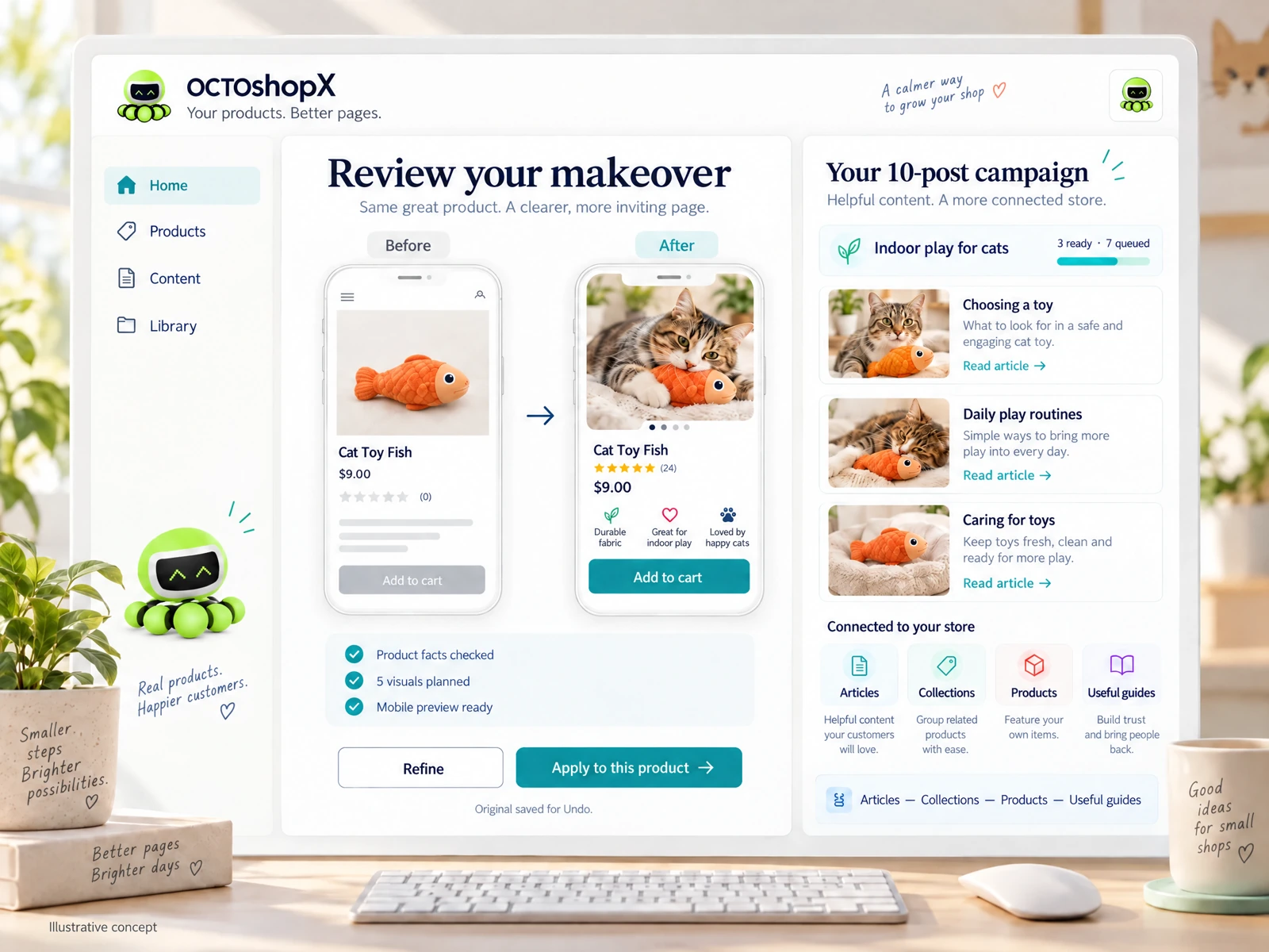
The title, price, options, availability, and primary add-to-cart action should read as one decision area. A visitor should not have to hunt through promotional graphics or long copy to choose a variant. Shopify’s product-page recommendations likewise prioritize clear options, visible pricing, and an identifiable purchase action [2].
Imagine a skincare store selling a cleanser in two sizes. Label each size with its volume and price, make the selected option obvious, and state whether a subscription or one-time purchase is selected. Check the page at a narrow viewport and with a long product title. A beautiful layout is not helping if the button slips below distracting content or variant labels become cramped.
- Make the primary action visually distinct from secondary links.
- Show variant names and relevant differences before the shopper commits.
- Verify that selections, price changes, and add-to-cart feedback are understandable.
4. Replace vague copy with concrete proof
Use short, scannable copy to connect a feature to a real customer benefit. State materials, dimensions, compatibility, care, ingredients, or limitations when they matter. Shopify advises organizing details so people can scan and answering likely questions on the page [1] [2]. Avoid generic superlatives that could describe any item; precise information reduces ambiguity without promising an outcome you cannot guarantee.
For a rechargeable desk lamp, ‘three brightness settings, USB-C charging, 28 cm tall’ is more decision-useful than ‘the ultimate lighting experience.’ Add a compact care or compatibility note if it prevents a common mismatch. Keep search phrases natural; the product title and description should still sound like something a person would understand.
- Use bullets for specifications shoppers compare, and prose for context or benefits.
- Separate verified product facts from suggestions about how someone might use the item.
- Move secondary detail into clearly labeled sections rather than deleting useful information.
Read the connected-content guide or explore product and blog specimens.
5. Treat trust and reassurance as part of the design
A visual makeover is not just decoration. It should make essential policies, proof, and next steps visible without overwhelming the purchase decision. Show genuine reviews where available, clarify shipping and returns, and make any warranty or guarantee specific to the actual policy. Shopify’s guidance includes customer reviews and social proof among useful product-page elements [2].
A homewares shop could place its verified review summary near the title and link to a full care guide below the product details. A new store without reviews should not manufacture social proof; it can instead present clear material, shipping, and return information. Avoid fake urgency counters or unsupported ‘best seller’ labels, which can undermine confidence.
- Use only authentic reviews and accurately describe their source or scope.
- State delivery and return terms plainly, including relevant exceptions.
- Keep reassurance close to the question it answers, such as sizing help beside size selection.
6. Run a small, interpretable test
Do not assume a redesign improved conversion because it looks cleaner. Choose one problem, make one coherent change, and compare the result against a defined baseline. For example, a merchant whose support team hears repeated fit questions could test adding model measurements and a size guide near the selector, while leaving imagery and price unchanged.
Before publishing, note the date, product or product group, audience, and primary outcome you will observe, such as add-to-cart rate or completed purchase rate. Also watch guardrails like returns, cancellations, and page speed. Allow enough time to cover normal traffic variation, avoid changing several elements mid-test, and treat low-volume results cautiously. If a formal split test is not available, use a staged rollout and compare like-for-like periods while noting other changes. There is no guaranteed uplift; the purpose is to learn whether the page better serves shoppers.
- Write a test statement: ‘If we change X for audience Y, we expect metric Z to move because…’
- Keep the comparison fair by holding other important changes steady.
- Record the result and the next question, including when evidence is inconclusive.
What should I improve first on a Shopify product page?
Start with the biggest unresolved shopper question or usability barrier you can verify. Check product facts, price and variants, delivery and returns, image usefulness, and whether the purchase action is easy to find. Fix clarity or accuracy problems before polishing decorative details.
How many product images should a page have?
There is no single ideal count for every item. Include enough distinct views to explain appearance, important details, scale, and use where relevant, without padding the gallery with near-duplicates. Review the sequence and crops on mobile.
How can I tell whether a visual change improved conversion?
Define the change, baseline, audience, time window, and primary metric before publishing. Compare like with like, watch guardrail metrics such as returns and speed, and avoid claiming causation from a small or confounded comparison. A test with an uncertain result is still useful if it guides the next iteration.
Sources & comparison notes
Provider-described features and prices can change. Check the linked sources and purchase terms before choosing a service.
- Ecommerce Product Page Optimization: 11 Elements · checked 2026-10-17
- Product Page: 15 Examples and Best Practices · checked 2026-10-17
- Shopify Magic and Sidekick · checked 2026-10-17
Install OCTOshopX. Give your store one clear job.
Improving a Shopify product page starts with better answers, not bigger claims: make product facts easy to scan, show the item clearly, and remove friction from choosing and buying. Review one meaningful change at a time and let measured evidence—not a visual hunch—guide what comes next. Install OCTOshopX.
A calm Shopify Product & Blog Studio: 5–10 useful visuals, connected articles and products, preview before publishing, and 1-Click Undo when needed.